Brand identity & packaging2025
Halden Coffee
A warm, tactile identity and packaging system for a Lisbon roastery growing from one café into nationwide retail.
The brief
Halden began as a twelve-seat café in Graça with a roaster squeezed in behind the counter. Five years later it supplied restaurants across Portugal and was preparing to launch in supermarkets, yet the brand was still a hand-drawn logo and a rubber stamp.
The team needed an identity that could hold its own on a crowded shelf without losing the warmth regulars loved about the café.
The approach
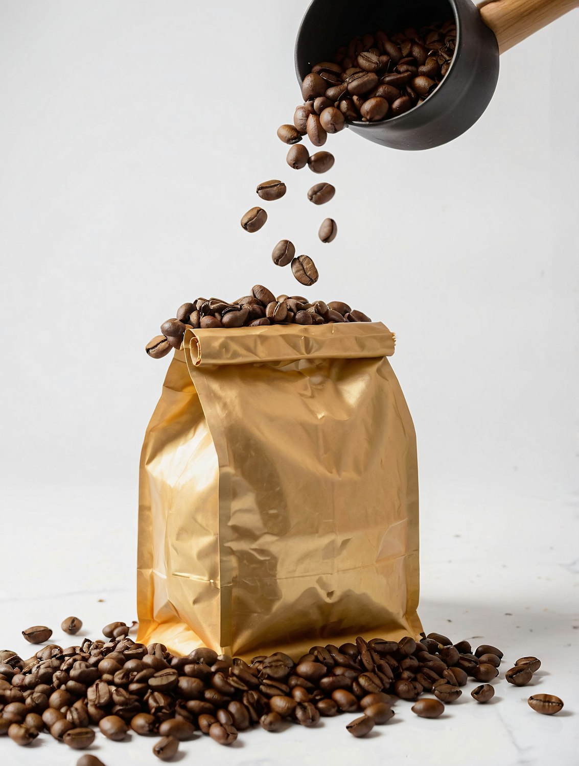
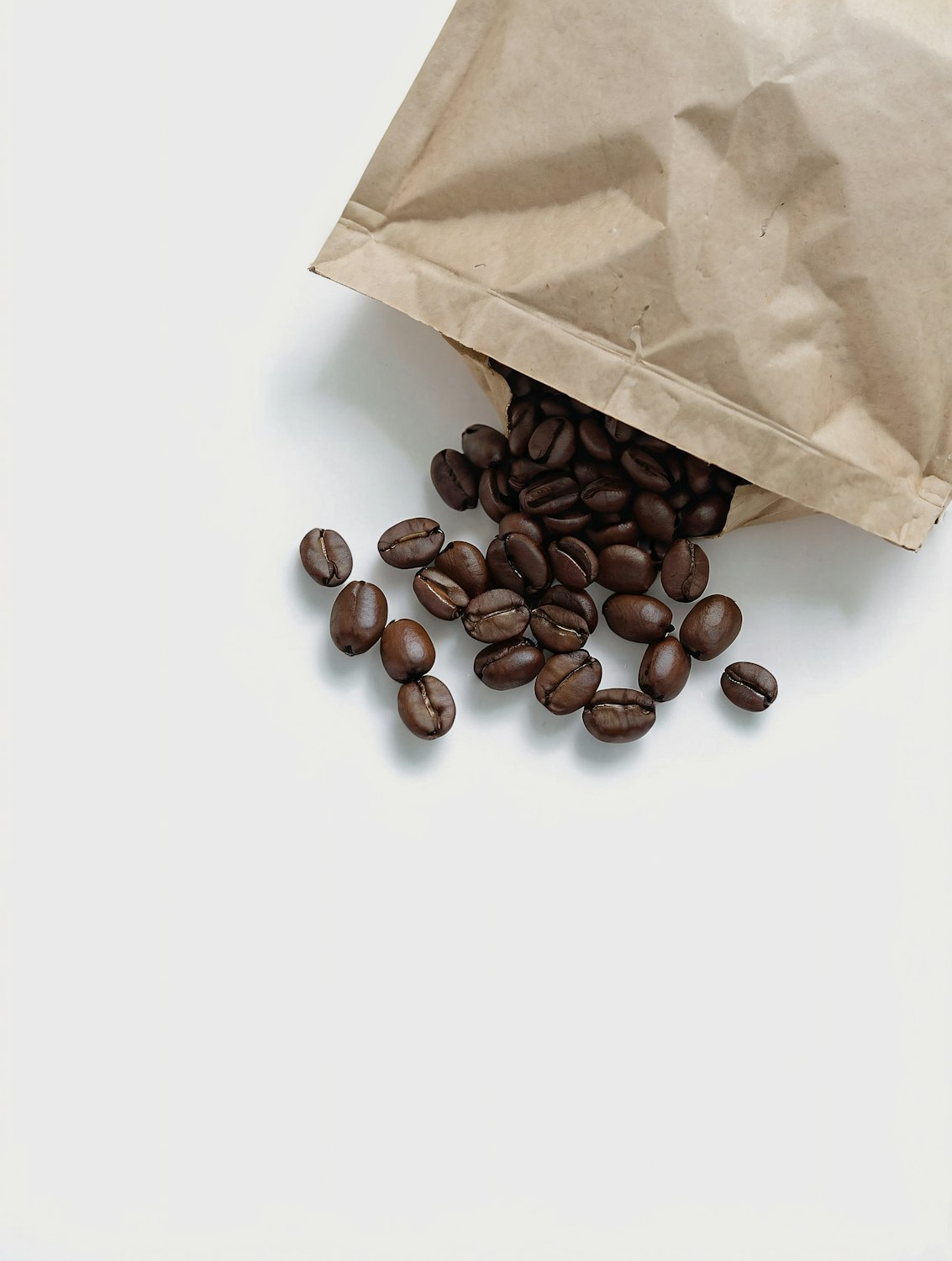
I spent a week in the roastery before drawing anything. The system that came out of it is built on the roast itself: every coffee gets a line traced from its real roast profile, so no two bags share the same mark. House blends ship in uncoated kraft printed in a single ink, while limited lots are wrapped in gold foil that makes them easy to spot.
A sturdy grotesk and a softer serif share the work, and a palette of six earthy tones signals roast strength at a glance.
The outcome
- Stocked in 140 stores within the first year
- Wholesale enquiries doubled in six months
- Print costs down 18% thanks to single-ink production